Anchors:
Front-end technologies
Tools in our hand...
HTML
HyperText Markup Language
Defines the structure of the document and the arrangement of elements on the page.
CSS
Cascading Style Sheets
Responsible for the graphic presentation of the website, such as colors, fonts, etc.
SCSS
Sassy CSS
A CSS language preprocessor that increases its capabilities.
Vanilla JS
Pure JavaScript
Basic implementation of a programming language, without libraries
JavaScript
Dynamic object-oriented language
Used to create interactive elements on websites.
jQuery
JavaScript library
Makes it easier to handle events on websites.
Vue.js
Progressive JavaScript framework
Used to build user interfaces.
Smarty
PHP template engine
It enables the separation of business logic from the presentation layer.
Twig
Flexible template engine
Written in PHP, used to separate logic from the presentation layer.
BEM
Block Element Modifier
Methodology for naming and organizing CSS and HTML code.
Bootstrap
Front-end framework
Providing components and tools to facilitate rapid design.
Webpack
Pack and build tool
It enables code optimization and creation of packages for web applications.
UI design
We Create Connection with the User
User Interface (UI), or simply the website interface visible to the user, is a key area of designing web applications, software or websites. It is everything that the user sees, touches and interacts with. We combine an innovative approach with the latest trends, we not only create interfaces, but also build bridges between the user and the virtual environment.
A good user interface includes several important elements:
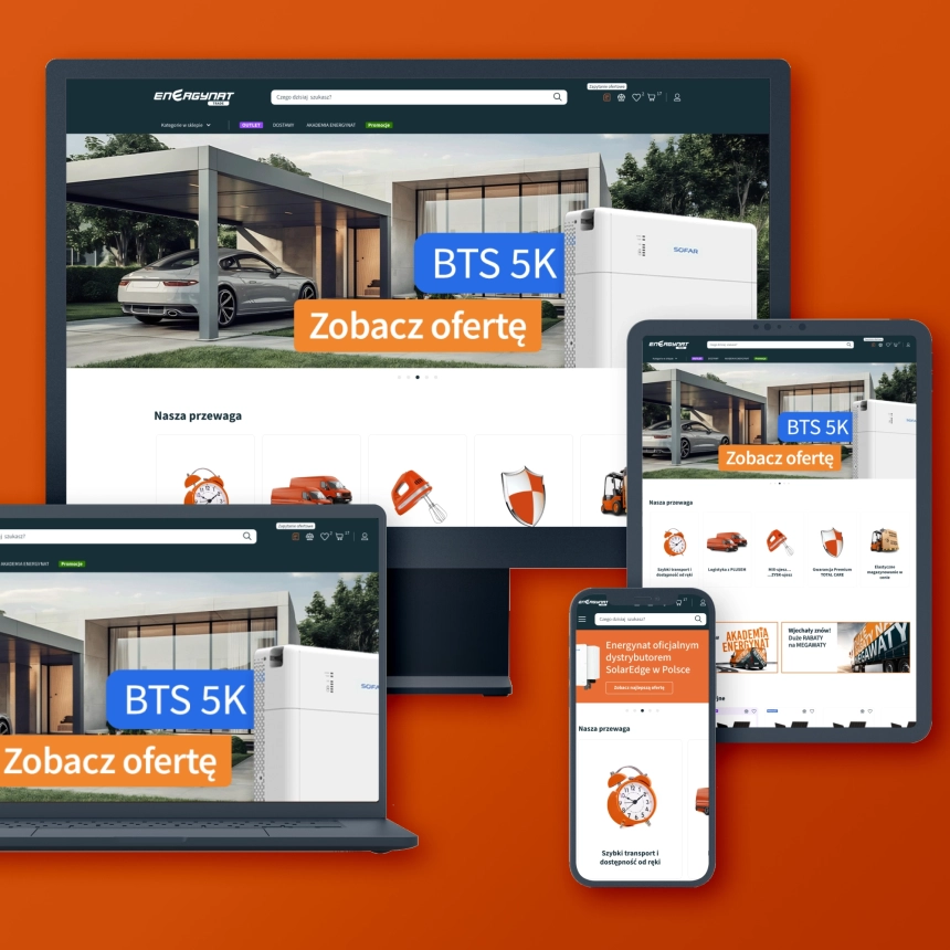
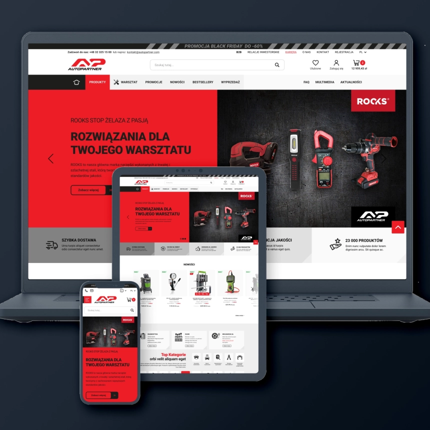
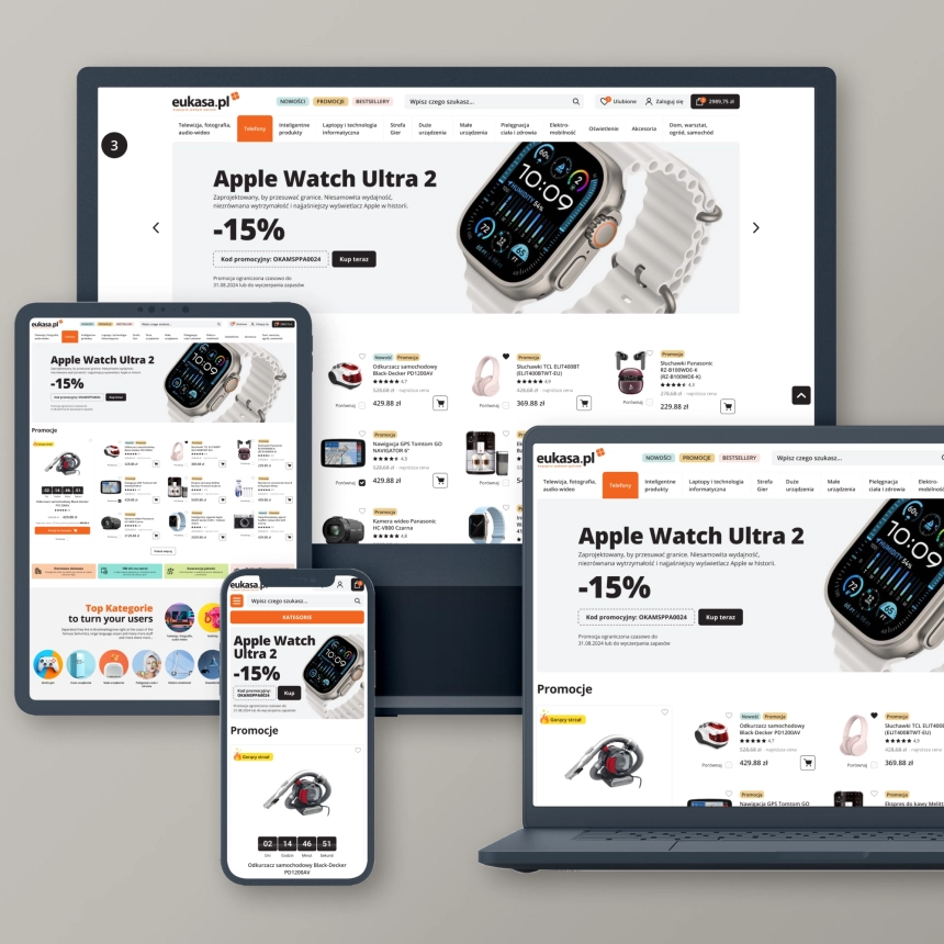
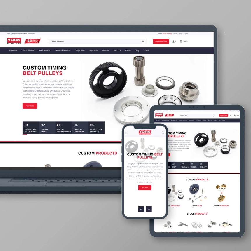
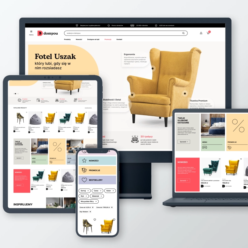
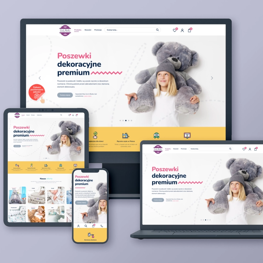
RWD: Responsive design
All our front-end designs are fully adapted to screens of various sizes, ensuring a good user experience regardless of whether they are using a computer, tablet or smartphone. Importantly, responsive design is one of the fundamental elements of positioning (SEO).
Why is responsiveness so important?
Nowadays, due to the variety of devices used to browse websites, responsive design has become an industry standard and its use is widespread and recommended.
UX: User Experience
This term is slightly broader than UI. UX covers the entire experience that users of your website have. Here is an example - an online store may have a perfectly designed website, i.e. a good UI, but if the purchasing process is complicated and requires providing a lot of unnecessary information or answering many different questions, the UX of such a website will be poor.
How do we design?
When working on your website, we design not only its appearance, but also its behavior and operating logic to make it as accessible and intuitive as possible for your customers/users.
We improve the quality of user experience
One of the UX solutions that we implement are various types of interactions and animations - they improve the quality of visual experiences when using the website and user engagement.
Performance optimization
Your future website should load quickly (ideally in less than 3 seconds) and respond quickly to user movements (e.g. button clicks). This is very important because some time ago Google implemented a new set of recommendations known as core web vitals (read more on the blog).
If your website does not meet the CWV requirements, its positioning will be very difficult. User experience will also suffer because such pages are slow to load and make it difficult to perform various activities.
The website you will receive from us will achieve good Core Web Vitals results, this is possible thanks to the use of several very effective solutions:

Application testing
Our testing procedures ensure that no matter who views your website and where, they will always see a fully functioning website.
Before the website is published online, it undergoes a series of tests to ensure that it will function properly and be displayed on various devices and browsers. This is the so-called cross-browser compatibility.
We perform such tests on X operating systems and Y different web browsers. This allows you to capture (and eliminate) errors that may be specific only to a given device or browser.
Our testing procedures ensure that no matter who views your website and where, they will always see a fully functioning website.
VSC
This acronym stands for version control system. We use two VCS systems – Git and GitHub. We chose these systems because they are flexible and efficient - they enable source code management both on local devices and in the cloud. VCS is a solution that allows us to track and manage changes to the website code without the risk that any change will cause the website to malfunction. This is one element of our testing procedures. In practice, this means that whenever you want to change something on the site, we will test that change in a secure environment so that there is no risk of the site going down as a result of that change.
FAQ
Find out more about Front-End

Do you have a question?
Contact us, our specialist will provide you with the necessary information.
We are here to provide you with support and answers to all your questions. Do not hesitate to reach out for our help - we are ready to support you!
Related posts

Jak audyt UX może przyczynić się do zwiększenia zysków w Twoim sklepie e-commerce?

Audyt SEO dla Twojego sklepu – ważny wstęp do pozycjonowania
Wszystko, co musisz wiedzieć o skutecznych wyprzedażach w e-commerce

Współpraca, na kolejne długie lata. Ja jestem mocno na tak i gorąco polecam. Mój projekt: kupopony.pl